Once you’ve activated the Mobile Header module in the WPHubSite WordPress then you’re all set to head into the customizer to make a beautiful looking mobile menu. With the colors & background module enabled already (which it should be) you already have many great options. The Mobile Header Module adds even more.
Here’s how to access the customizations you can make with the Mobile Header module once you’re in the WordPress customizer.
Step 1: Click Header in the WPHubSite Theme WordPress Customizer.

Step 2: Click Primary Menu.

Here’s where I’m getting a bit off-topic with this help article but important nonetheless. Not all the options I cover going forward come from the Mobile Header module. In fact, the Mobile Header module only adds the menu style option, border for menu items, and border color. The rest are already there by default but I will cover them anyway.
Here’s what everything does for the mobile header.

Option 3: Choose where the breakpoint (in pixels) is for the mobile menu to show up. This will correspond to what devices you want the mobile menu to show on.
Note: The most common breakpoints are 768px for small/mobile devices and 992px for medium/tablet devices which are also the defaults for the WPHubSite Site Builder.

Option 4: Type in a label if you’d like the mobile menu to also display text. For usability, this option is always a good idea to use. Something like MENU is always helpful unless your website is for a restaurant in which case NAV may work better. If you typed MENU it would look something like the image to the right.
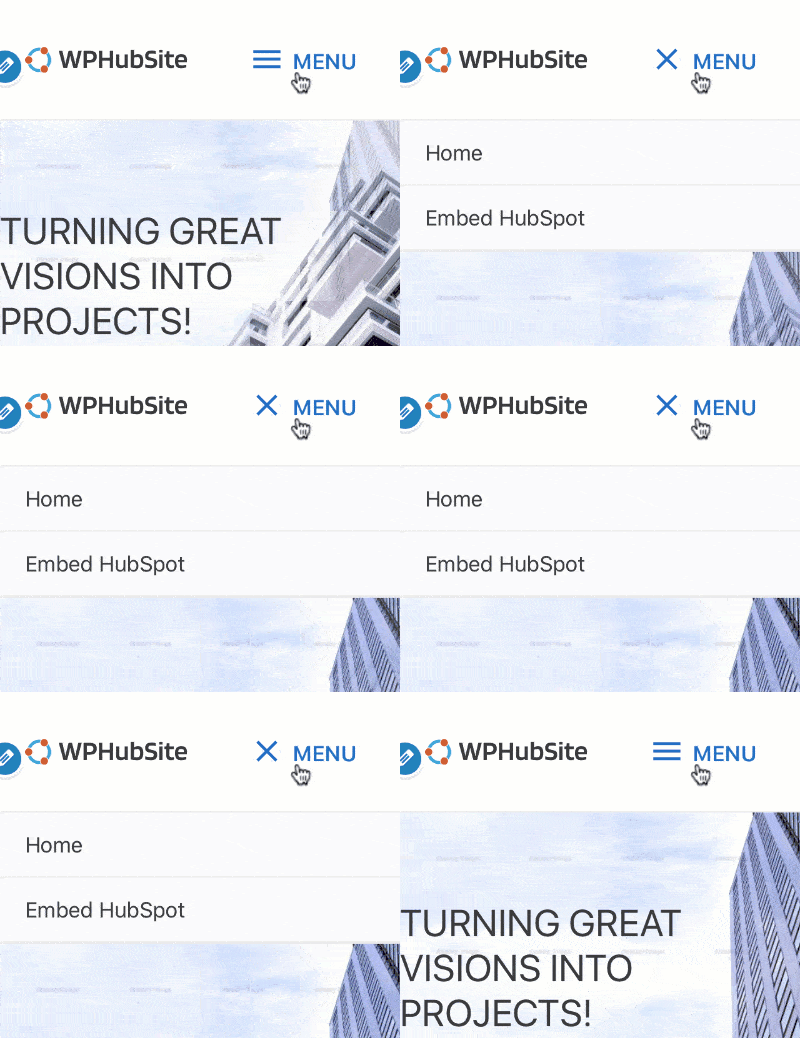
Option 5: This one has several different options to choose from and some menu types have additional configuration choices. Below are three different animations and one image illustrating each one.

Dropdown 
Flyout 
Full Screen 
No Toggle
Option 6: Choose between fill, outline, or minimal (the default). Here’s what each of them does.
- Fill: A button filled with a color.
- Outline: The menu icon and text are surrounded by a border.
- Minimal: This is the default option and looks exactly like the menu icon & text above.
Option 7: Choose the color for the button, border, or icon & text.
Option 8: Choose how you’d like sub-menu items to open.
- Icon: The icon next to a sub-menu must be clicked to expand the item.
- Link: The text of a sub-menu item must be clicked to expand the item.
Option 9: Increase or decrease the border size of the menu items.
Option 10: Choose what color to make the menu item borders.
That’s it for the pro modules Mobile Header options. There are other options for the menu in the colors, typography, and spacing sections but those are all self-explanatory. Here’s a brief run-down of some of those options.
- Colors: Choose colors for the menu and sub-menu items. This section lets you control settings for normal (when the menu hasn’t been interacted with), hover (the cursor has hovered over an item), and active (user is currently on that page).
- Typography: Overwrite menu and sub-menu text from inheriting settings from the global typography settings of your website.
- Spacing: Choose the padding around each menu and/or sub-menu item.
That’s it! You’ve set up everything needed for a really cool looking mobile menu. Be sure as you’re changing menu items for mobile that you’re also in the mobile view in the WordPress customizer.
Don’t forget there are lots more pro modules that you can activate in the WPHubSite Theme.


